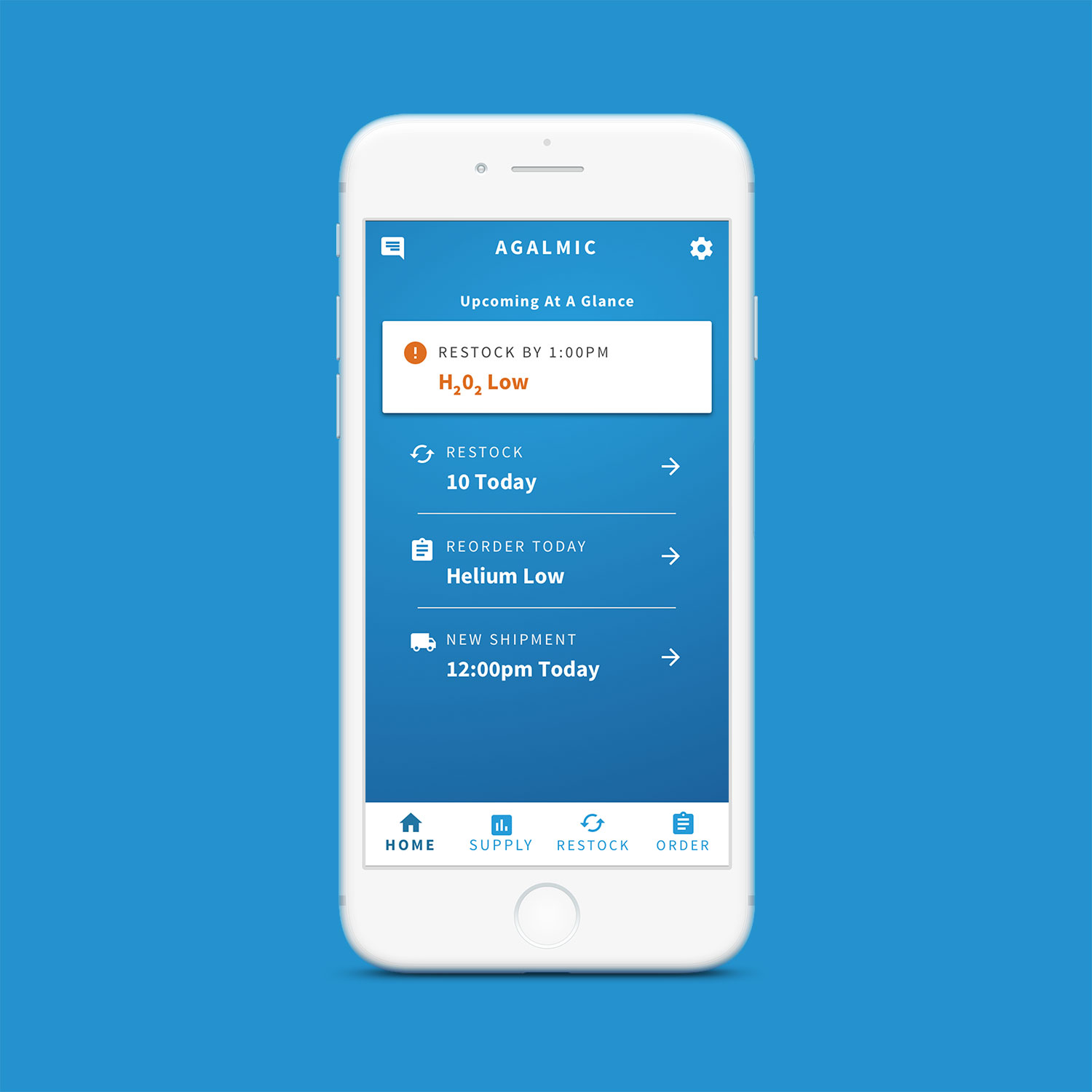
Agalmic Web App
Agalmic is a startup that provides real time inventory for laboratories.
MVP | UX | UI
Challenge
I worked with Agalmic's lead engineer to determine how to bring their mobile-first web app up to a usable MVP product. Through each iteration of my design process, I was extremely careful about making sure that my designs would not increase the scope on the development side.
CLIENT
Agalmic
SERVICES
Mobile First Web Design
YEAR
2017
Scope Definition
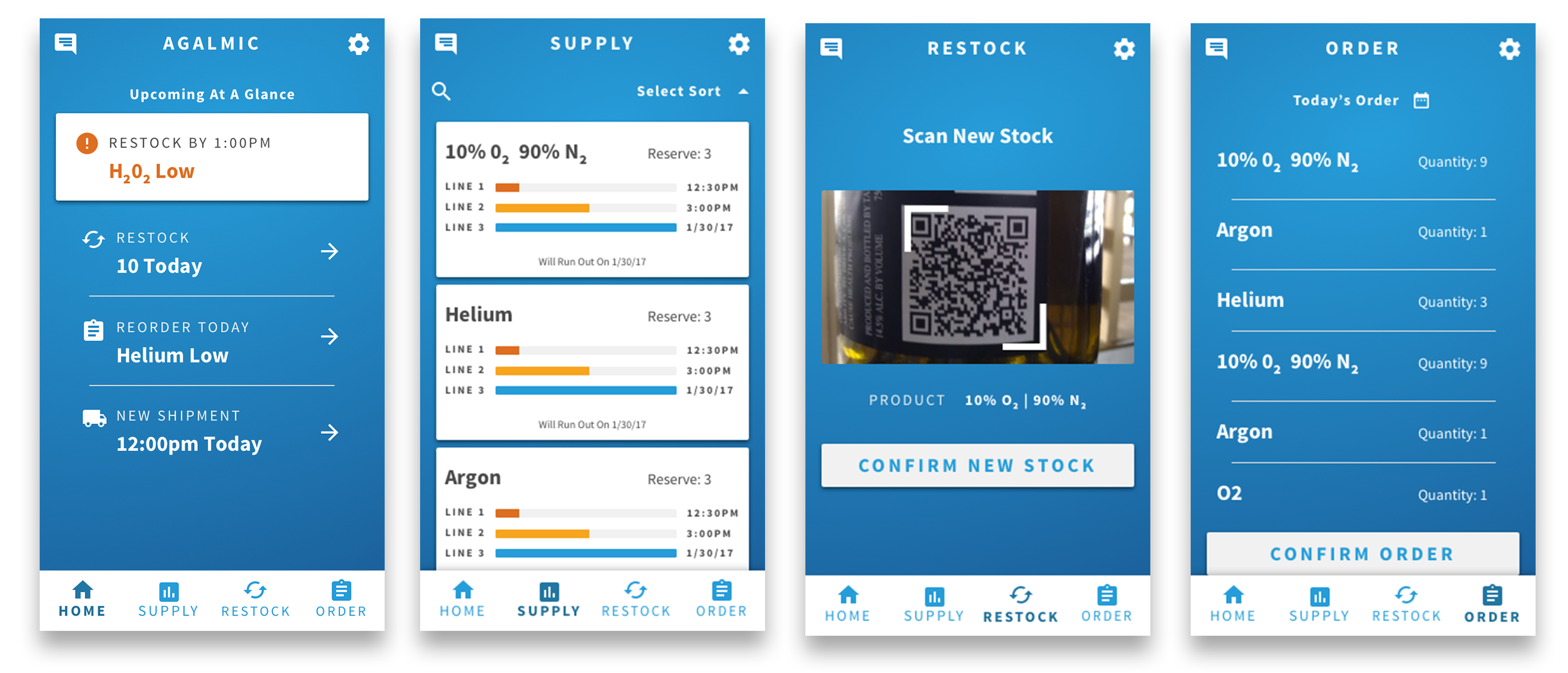
Agalmic provided their comps for key features that needed to be redesigned to be human-centered. The web-app's key interation needed to provide up-to-date inventory for the labratory's gases they manage. To make sure the user's experiments never failed, the app had to have multiple triggers to reorder and restock the gas tanks.
I had 2 weeks to revamp the UX & UI before coding had to start.
User Flows
Research
Labratory interactions aren't exactly my wheelhouse, so I had long conversations with one of the engineers who worked in a lab like the one I was designing for. I gained a holistic view for how the lab workers interact with the gas tanks, and their different responsibilities throughout the manual inventory process. Ideally, I would have loved to shadow each lab worker around to better understand the idiosyncrasies in their work that we could help design for.
User Flows
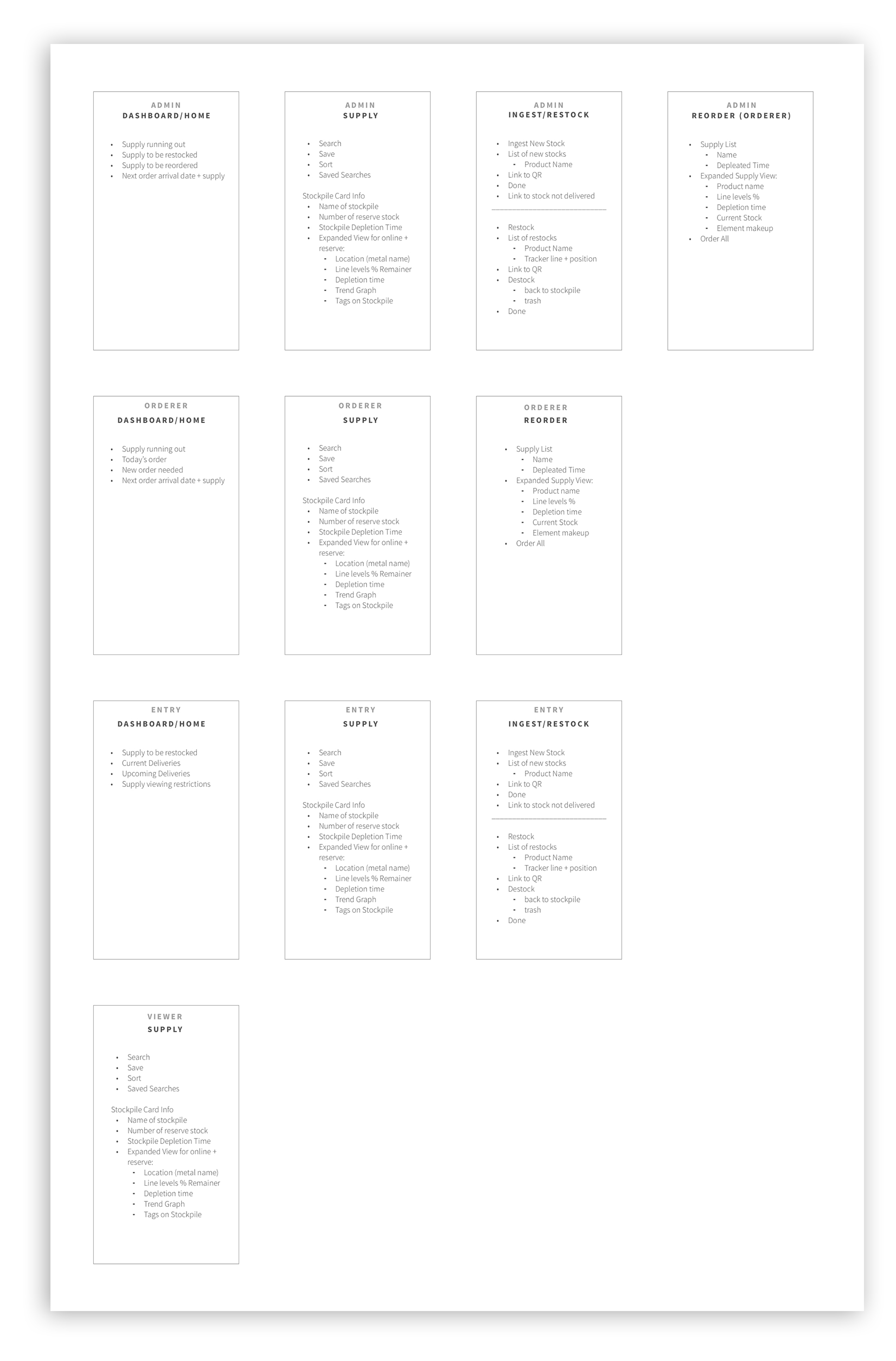
I broke the app down into 4 user profiles that they would have access to - admins, orderers, entry workers, and viewers. I outlined the key information and interactions for each screen and user. For the MVP, only 4 primary pages would have to be developed, then could be reused for the other user permissions.
Interface
Based on the use case and the skills of the engineering team, we deviced on a web-app with bootstrap's framework. Any interactions that required an annoying amount of coding, such as a calendar picker, I recommended pre-made components that worked with the UI.
Mobile First Design
Since all of the users except the admins would be using their phones while running around the lab, it was pertinent to make the app mobile-first. One challenge was fitting all of the data needed on a small screen. By implementing the use of cards
Tablet
I re-worked the mobile view to be beneficial to the desktop or tablet-using administrators.
