Peek Pro
Peek is a real-time availably software for the tour and activity industry.
INFORMATION ARCHITECTURE | DASHBOARD PRODUCT DESIGN | ONBOARDING UX
IA Challenge
Peek's users are notoriously low-tech, but need a powerful backend to run their business. To help our users better navigate and utilize the backend product, the design team and I completely redid the product's UX and IA to be more human-centered.
Research
I immersed myself with our user's challenges by spending 5+ hours a day acting as an account manager for a few key users. By being the point of contact for our users, I understood their pain points, outlying use cases, and missing features first hand. I took on the information architecture with a human-centered lens, maintaining awareness of lessons learned from the users.
Since the management software was in it's early years, it's IA was feature-based, tacking on new features wherever necessary. The poor UX & IA prevented our users from understanding Peek Pro's power to help manage their business. With this in mind, I experimented with several different user flows that would result in an improved IA.
Information Architecture
I push the simplicity of the IA as far as possible, staying true to my simplistic design philosophy. In this first version, I broke down the product features in three categories: features used daily, used weekly, and only during the onboarding.
Knowing that our low-tech users would be overwhelmed by too many changes, I found a happy medium with the current IA and making it behavior based versus feature centric.
UX Phase
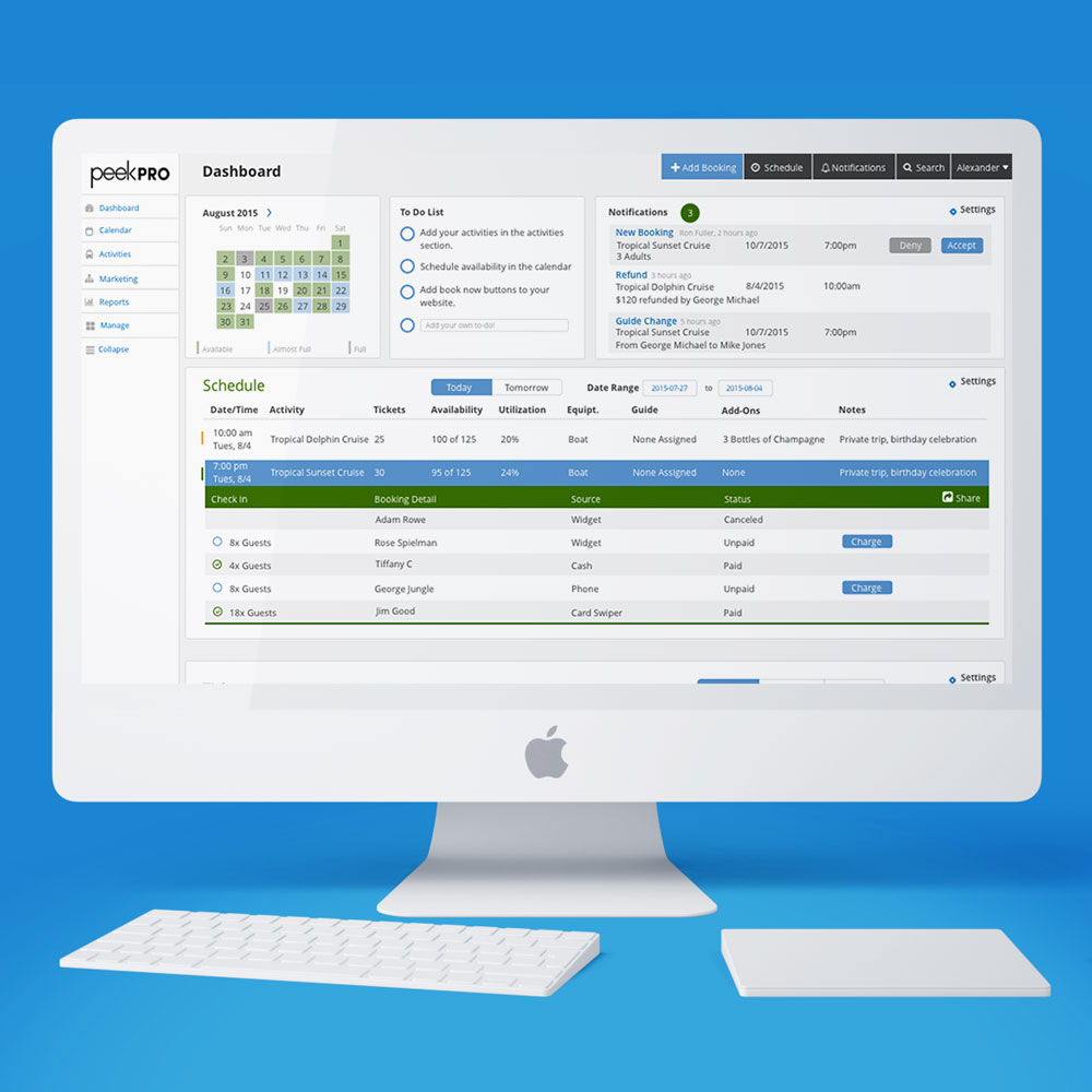
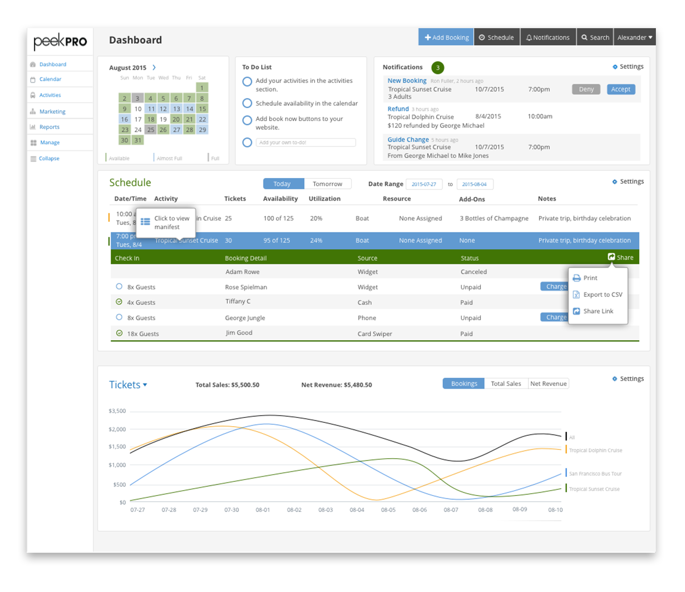
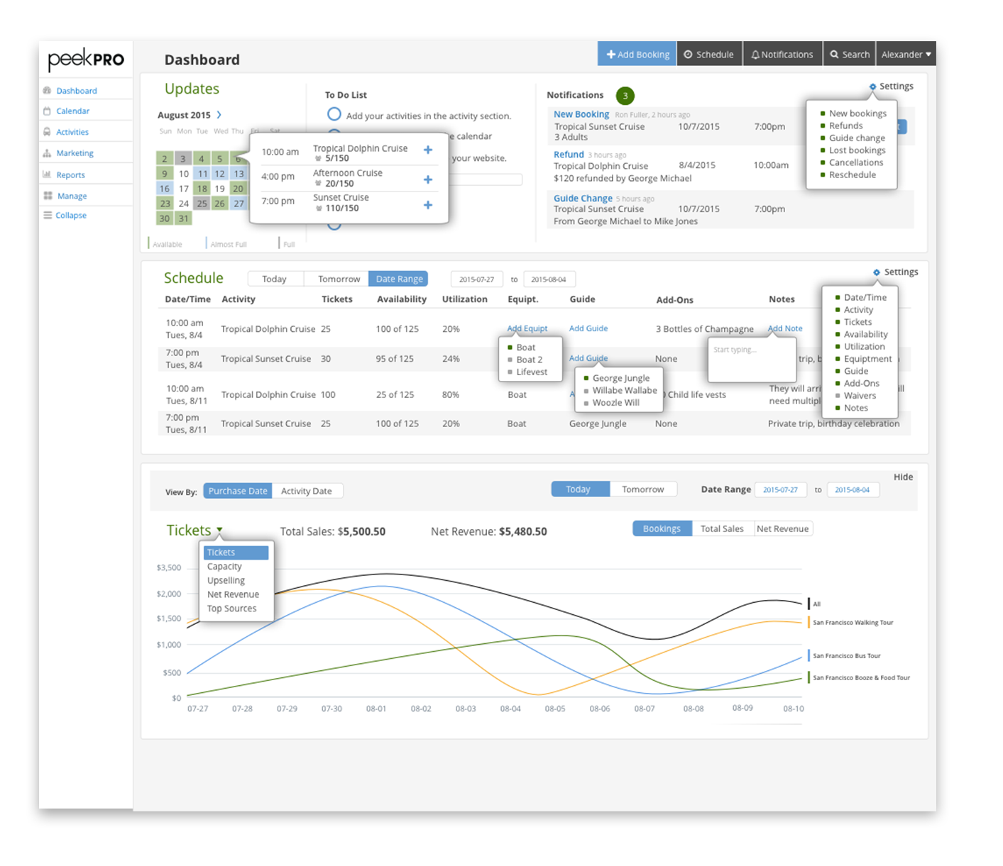
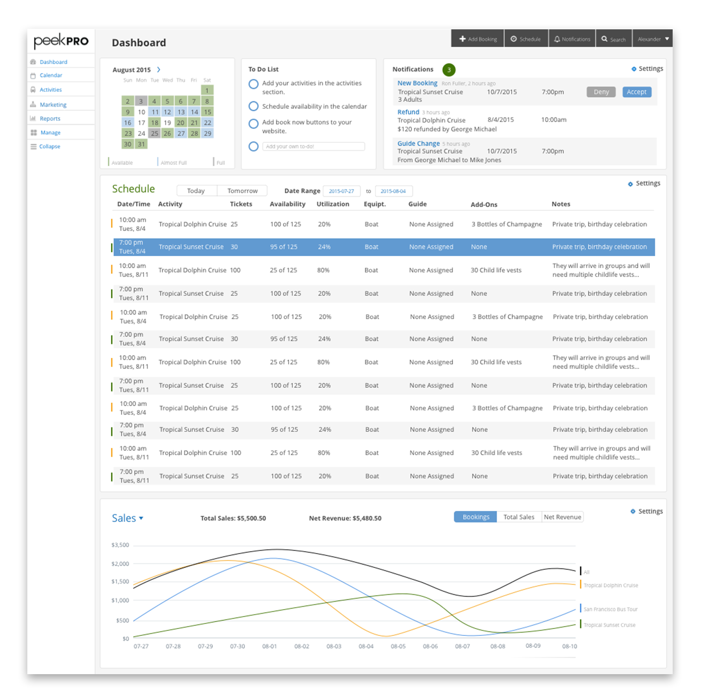
Creating wireframes of common user paths with the new IA, I redesigned the dashboard to allow the low-tech user to access their daily tasks in one interface. I structured the features specifically to simplify the user's interactions with the product. I sadly don't have the wireframes that I handed off to my collegue to design the final UI as shown below. Featured below are elements of the product design that I drove through my research.
The clean and simplistic dashboard can be easily customized right where the user is interacting with it - no need to toggle into a settings panel where the descriptions would confuse a non-tech savvy user. The drop downs (on hover) allow a lot more functionality for advanced users and larger businesses.
Onboarding Challenge
Peek's onboarding process was clogging up with too many new users and the onboarding team couldn't keep up. We needed a fast solution to help prevent dropoff of new users.
SERVICES
UX Design, Lean Design
YEAR
2015
Research
I took a hands-on approach to determine bootlenecks in Peek’s onboarding process, by personally onboarding users. I determined the biggest hurdle for users was adding in the activities they offered. Without adding their Activities, users couldn't understand Peek's value to their company. Because a large time investment was needed to see Peek's value, users would often churn.
Wireframing
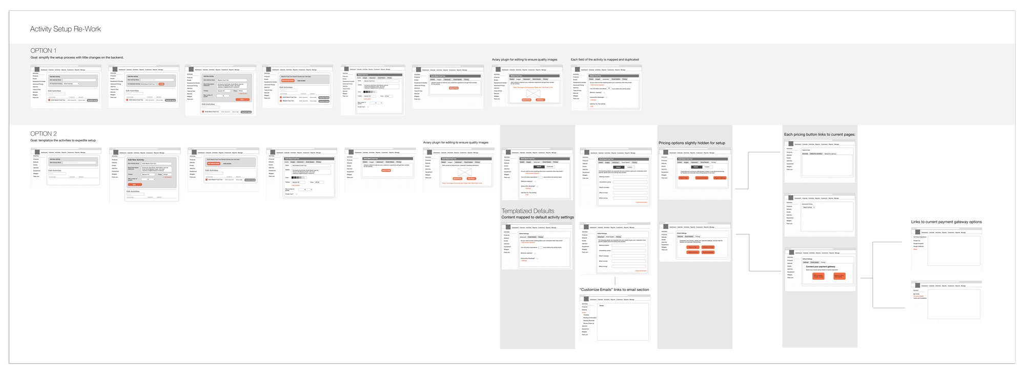
After determining the key bottleneck, I experimented with many different solutions to help speed up the often repetitive process of adding activities. I turned the 3 page setup process into a simple facade with customizable options hidden for the low-tech user. I specifically designed this to be a side project between sprints, requiring little engineering resources. The feature went straight from wireframes to development in the product.
Lean Design
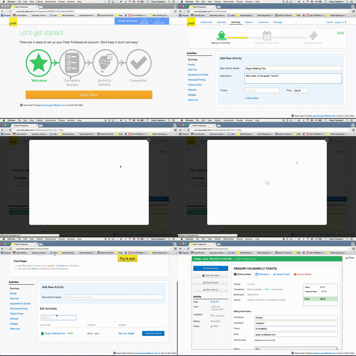
Working directly with a lead engineer, we determined the scope within our strict timeline (1 week) and resources. I wireframed a few initial options within our constraints with the goal to show the user Peek's added value within 3 steps and 5 minutes. Deciding on a pop-down module to grow with the product as it changes, I mocked up a high fidelity version in Sketch and created a rough prototype for the engineer to build. In just the first month using the automated onboarding module, the install rate increased by 20%.
