Tia App
Tia is a women's health AI chatbot that specializes in helping women find the right birth control for their bodies.
UX | UI
Challenge
Tia had a few specific UX challenges to make their conversation flow seamless between the AI bot and human responses. They also needed help so a user wouldn't get stuck in a conversation flow.
CLIENT
Tabu Health
SERVICES
UX, UI
YEAR
2017
Research
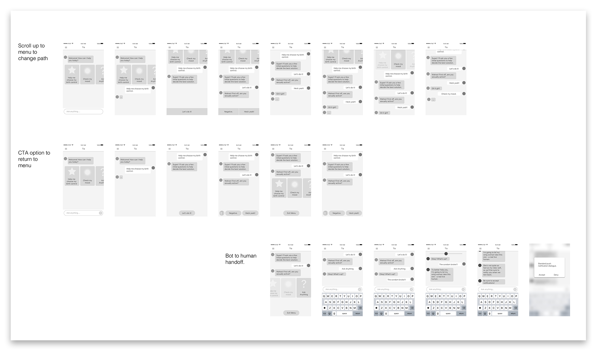
I start my design process by doing full audit of the current state of the app to see how I can add value while still focusing on the defined challenge. I tested various women's health apps and read their reviews to determine what the space is doing well and could improve on.
Wireframing
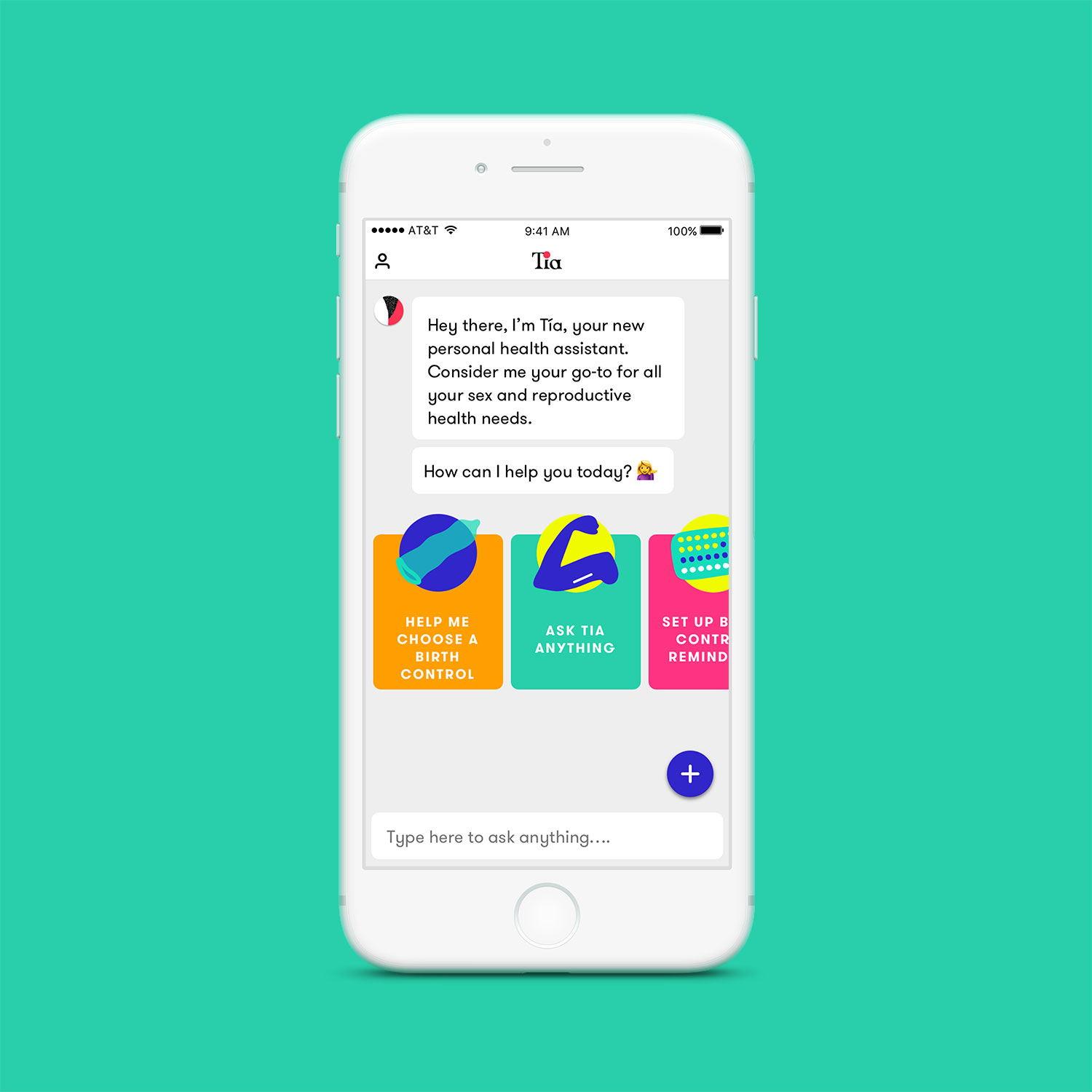
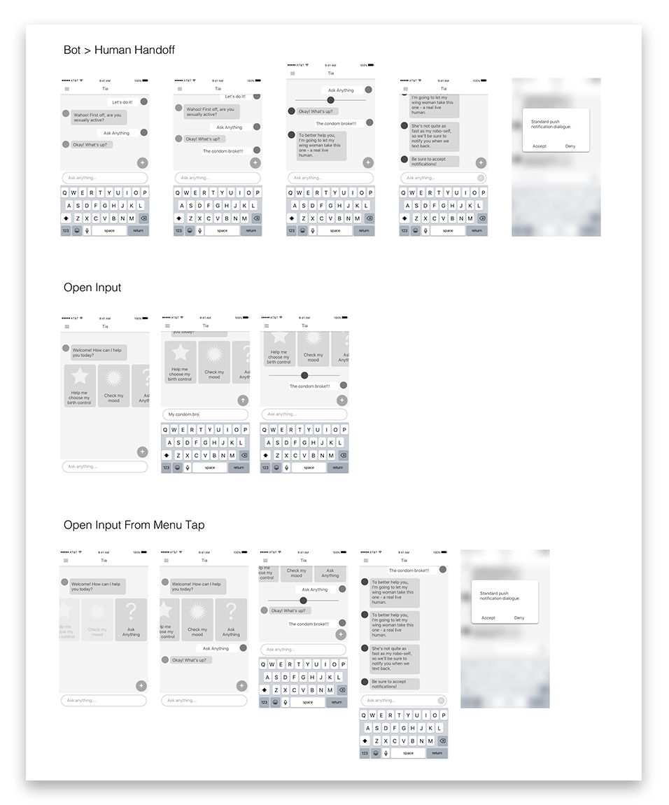
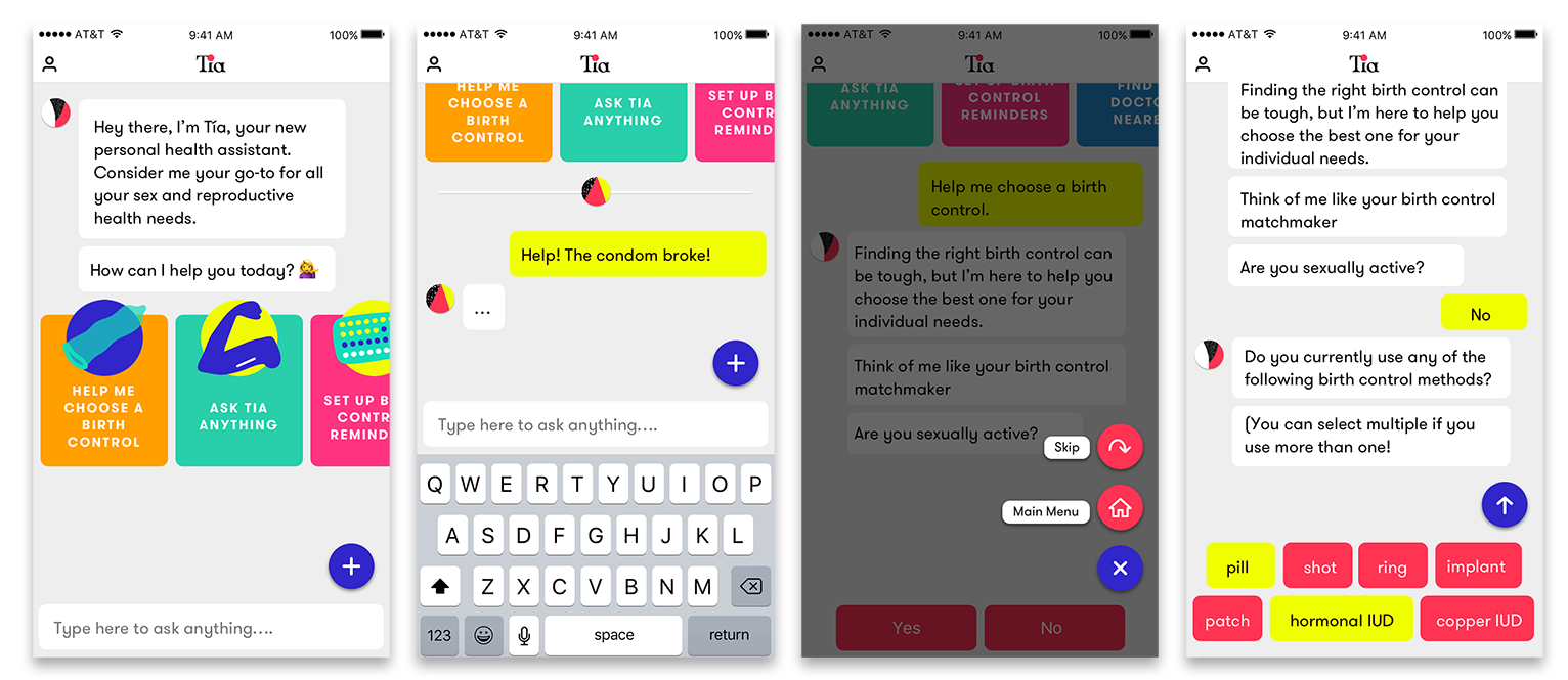
After a brainstorm session with Tia's founders, we determined a few possible solutions that would work with the backend. During this discussion, I recommended specific UI changes to help bring the brand's character into the interactions. We decided on scrollable menu cards with illustrations versus a pop up list menu, and changing the UI of the response chat options to incorporate more negative space for optimized tappability.
Interface
Since we were on a tight deadline to launch, the UI phase of this project is really where all the ideation came together.
Menu Exploration
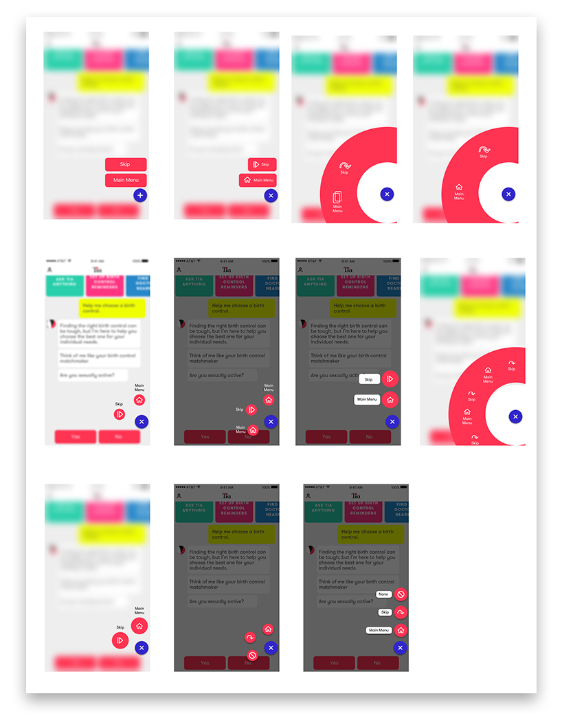
How the menu worked was the biggest challenge. I experimented with multiple iterations to determine the right balance between simplicity and fun within the interaction. The gif below to the right is the final implementation.
Final UI
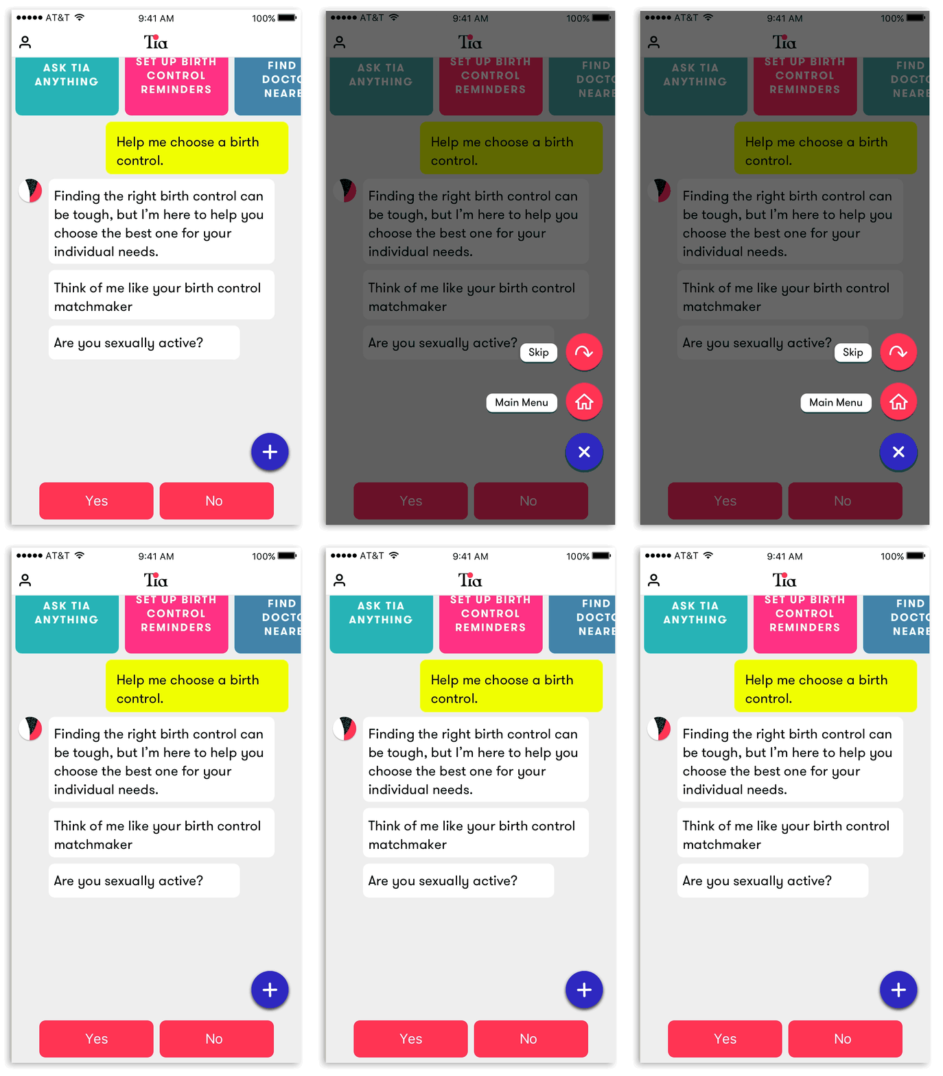
1. The tappable menu cards bring the playful spirit of Tia's brand into the app.
2. The bot to human handoff becomes obvious with a line break and change of avatar. The copy gives the user insight of the response time differences and let's them rely on push notifications to interact over the course of time.
3. FAB menu expanded.
4. I mirrored the chat bubble UI to signify to the user that each bubble will be sent as a message.
